Siddharth Sridhar: Anatomy of an outbreak
Siddharth Sridhar, clinical assistant professor from HKU ’s Department of Microbiology analyzed the HKU School of Public Health COVID-19 dashboard in an article published on his Facebook on July 26, 2020. He emphasized the variable lag time from symptom onset and confirmation dates and believed the strict control measures are taking effect. Below is the full article with updates by the author on 5 August, 2020.
Anatomy of an outbreak
Seeing COVID-19 case numbers increase with daily new ‘record highs’ is scary. We have now had case numbers exceeding 100/day in Hong Kong for the last 4 days. However, it is more informative to look at the epidemic curve than the daily case counts.
The two graphs below are taken from the excellent HKU School of Public Health COVID-19 dashboard, which is updated daily. The graphs have an important difference: the top one shows case counts by date of symptom onset in patients while the bottom one shows case counts by date of confirmation of COVID-19 in patients.
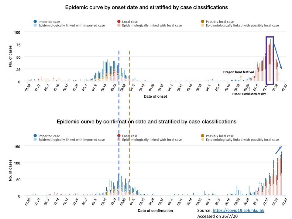
Can you spot the differences?
1) Firstly, the upper graph is a more accurate indicator of the extent of community COVID-19 transmission than the bottom graph. This is because people present to medical attention after a variable lag time from symptom onset. So, the symptom onset date is a better reflection of COVID-19 in the community than confirmation date. Looking at the outbreak in March, when the confirmed case counts are just reaching their peak, the epidemic curve shows that the case counts are already starting to decline (blue dotted line added by me). And by the time the confirmed case counts are declining, the epidemic curve shows almost no new local cases (orange dotted line added by me).
2) Looking at the current outbreak, it is clear that the first wavelet in early July occurred approximately 1 incubation period (IP) after the Dragon Boat holiday while a second wavelet occurred approximately 1 IP after the July 1’st holiday. Crowding in indoor areas during these two public holidays and the intervening weekend has propagated the current outbreak.
3) These two wavelets resulted in massive community transmission causing a peak of cases from July 15 – 18 (marked by me using a purple rectangle). Most of the 100+ cases that we heard about in end-July represent this peak (~ 1 IP since early July + lag-time before case confirmation). This peak fed another even larger peak from July 20 – 25; forming the epidemic curve pattern of a propagated outbreak.
4) It is important to note that the epidemic curve always appears on a downward trend irrespective of the direction of the confirmed case count curve because of the aforementioned lag time between symptom onset and presentation. As this lag time shortens due to increased public awareness and testing availability, the epidemic curve becomes more ‘predictive’. For example, we now observe that the daily confirmed cases have dipped slightly and the last major peak on the epidemic curve was on July 27 (9 days ago at the time of writing). Either this is a dip before another peak (a feature of a propagated outbreak) or it represents a genuine downward trend in COVID-19 transmission due to stricter control measures and social distancing introduced since mid-July. I am hopeful that it is the latter given the apparent decline in the effective reproductive number (also available in the SPH dashboard).
5) So what do we do next? We need to push ahead stringently with physical distancing and wear face masks outside the home. This is because we are aiming for a ZERO COVID Hong Kong, not just reducing the case numbers. With an outbreak of this size, you are going to have many little sub-outbreaks flaring up across the territory in coming days (like the U Hall outbreak and wet market outbreak). But if everyone remains vigilant, the sizes of these outbreaks can be controlled.
Take heart. This battle is winnable.